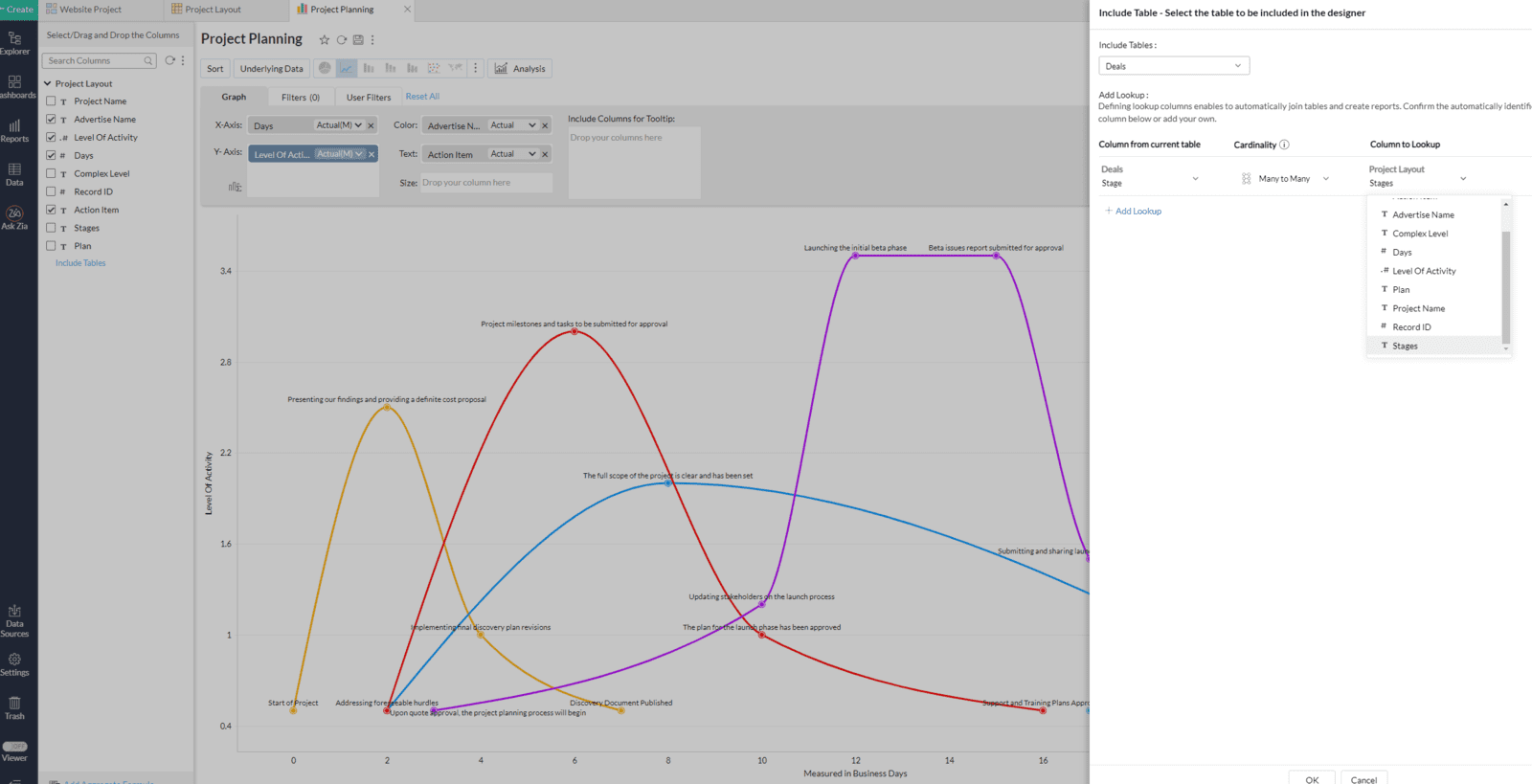
Project Planning Tool

Discover the benefits of our interactive tool, designed to help you visualize the differences in time and effort required for various project phases. Based on your selected complexity level and plan, you can make informed decisions about the resources and support necessary for project success. Explore the comparison between ProjectPro and SolutionLab to gain a deeper understanding of level of activity and project duration.

For the best experience, we recommend accessing our Project Phase and Level of Activity Comparison Graph on a desktop or laptop computer. This will allow you to fully interact with and explore the graph, making it easier to plan your project and understand the differences in time and effort required for each phase. So, grab a seat at your desk and get ready to plan your project with confidence!

Here are some examples of how you might use our Project Phase and Level of Activity Comparison Graph to plan your project:

  • If you're looking to make basic improvements to your system or process, you might choose the Basic Boost complexity level and the ProjectPro plan. According to the graph, this would require about 7 days of discovery, 20 days of development, 18 days of launch, and 7 days of support. You can see that the level of activity is relatively low during the discovery phase, but increases significantly during the launch and support phases.

  • If you're looking to implement more advanced strategies and overhaul your system or process, you might choose the Extensive Overhaul complexity level and the ProjectPro plan. This would require a longer time commitment, with about 26 days of discovery, 81 days of development, 73 days of launch, and 23 days of support. The level of activity is high throughout all phases, indicating a need for more resources and support.

  • If you're working on a smaller project and want to minimize your time and effort, you might choose the Enhanced Efficiency complexity level and the SolutionLab plan. This would require about 10 days of discovery, 36 days of development, 32 days of launch, and 12 days of support. The level of activity is lower overall, indicating a more streamlined approach.

These are just a few examples of how you can use the graph to plan your project. We hope it helps you make informed decisions and achieve your goals!

Maximizing efficiency with our Project Phase and Level of Activity Comparison Graph

This interactive tool is designed to help you visualize the differences in time and effort required for different project phases, depending on the complexity level and plan you choose.


To use the graph, simply select a complexity level from the options provided: Basic Boost, Enhanced Efficiency, Advanced Strategy, Extensive Overhaul, or Complete Customization. Each level represents a different level of depth and attention required to successfully complete the project.


Next, select a plan: ProjectPro or SolutionLab. ProjectPro is our recommended plan, as it offers a higher level of activity and support throughout all stages of the project. SolutionLab, on the other hand, has a lower level of activity and reduces the support stage.

The graph displays the length of time required for each project phase on the x-axis and the level of activity on the y-axis. The phases included are Discovery, Development, Launch, and Support. By hovering over each point on the graph, you can see the exact number of days and level of activity for each phase.


This tool is a great resource for planning your project and understanding the resources and support you'll need to succeed. We hope it helps you make informed decisions and achieve your project goals. Thanks for using our Project Phase and Level of Activity Comparison Graph!

Financial ROI Calculator for Automation Processes

This is a tool that helps businesses estimate the potential savings from implementing an automated process. It takes into account the company's estimated weekly revenue generation, the number of agents involved in the current process, and the estimated daily hours that can be saved through automation. The calculator uses a double-sided slider to allow the user to adjust their estimates and calculates the average hourly contribution of each agent to the overall revenue. The final results are displayed in a clear and easy-to-understand format on a dashboard, providing a valuable tool for businesses looking to improve their financial performance.

It's important to note that the success of the automation process is not only determined by the technology or the solution being implemented but also by the business processes and the way it is integrated into the company's operations. The report highlights the value of providing clear and quantifiable estimates of the potential financial benefits of automation, which can be a key factor in making decisions about automation projects, comparing the potential returns of different automation solutions, or assessing the potential impact of different automation scenarios. By considering all these aspects, businesses can effectively implement automation and achieve maximum return on investment.
  • Locate the report and select the "Weekly Cash Flow of the Current Process" filter.
  • Input the estimated weekly revenue generated from the current process.
  • Select the "Personnel Involved in the Current Process" filter.
  • Input the number of agents involved in the process.
  • Select the "Estimated Daily Hour Productivity Increase from Automation" filter.
  • Input the estimated hours that can be saved daily through automation.
  • The calculator will then perform the calculations and display the estimated monthly and annual savings on the dashboard in a clear and easy-to-understand format.
  • Use the double-sided slider to adjust your estimates if needed.
    In conclusion, we at Online Business Empires are confident that our expertise and experience in automation can help your business achieve significant cost savings, increased efficiency, and improved performance. Our financial calculator is just a glimpse of the value we can bring to your organization. We have a team of experts ready to work with you, every step of the way, to assess your current processes and develop a customized solution that aligns with your unique business needs and goals. We are committed to helping you achieve your desired outcomes and make the most of the automation journey.

    Don't wait any longer, take the first step towards achieving your goals and click the button "Ready to work with us? Click Here" to start our preliminary questionnaire. This questionnaire will help us understand your business better and allow us to provide a more accurate assessment of how we can help you. We look forward to the opportunity to work with you and help you reach your full potential.

    Introducing our Project Phase and Level of Activity Comparison Graph: A Data-Driven Approach to Project Planning

    As a company, we understand the power of data and analytics in helping us make informed decisions and plan for the future. That's why we were excited to develop a new interactive tool that illustrates the differences in time and effort required for different project phases, depending on the complexity level and plan you choose.

    But this tool wasn't just built for practical purposes – it was also created to showcase the creativity and flexibility of our data visualization skills. By using Zoho Analytics, we were able to design a visually appealing and intuitive graph that not only helps us plan our projects, but also illustrates the process in a clear and easy-to-understand way.

    The tool is especially helpful for our clients, who can use it to understand the resources and support needed for their projects and make informed decisions about the best course of action. It's a valuable resource for anyone looking to plan a project and ensure its success.

    We're proud of the tool we've built and the insights it provides, and we hope it will serve as a useful tool for our clients and others looking to plan their projects with confidence. The power of data and analytics is vast, and we're always looking for new ways to harness its potential and use it to create innovative solutions.

    We hope you've enjoyed learning about our Project Phase and Level of Activity Comparison Graph and how it can help you plan your projects with confidence. If you have any questions or would like to know more about how we can use data and analytics to support your business, don't hesitate to contact us. Our team is here to help and we look forward to discussing your needs and how we can work together to achieve your goals. Don't hesitate to reach out – we're just a message away.

    A letter from the Founder

    I wanted to take a moment to introduce myself and my company, Online Business Empires. We specialize in providing Cloud Based Strategies using Zoho One to businesses like yours, and we are dedicated to helping our clients achieve their goals and succeed in their industries.


    As a Business Solution Architect, I have 5 years of experience in Cloud Based Solutions and have worked with a wide range of companies to develop and implement effective strategies and solutions. I am confident that my expertise and my team's skills can make a real difference for your business.


    I would be happy to discuss your needs and how we can work together to achieve your goals. Please don't hesitate to reach out to me if you have any questions or would like to schedule a consultation.


    Sincerely, 

    Jharry Guevara

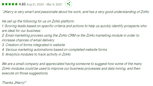
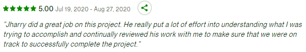
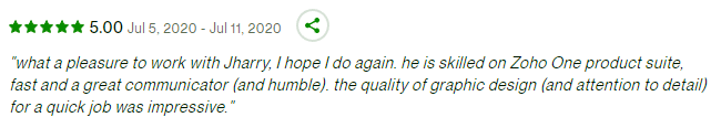
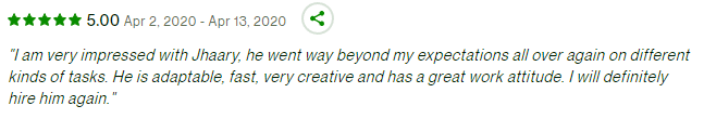
    Client Impact Reviews

    Authorized Partner

    Architecting Tomorrow's Business, Today
                    
    Address: 111 Congress Avenue Suite 500, Austin, Texas, 78701, United States of America
    Phone: (888) 997-4031 Email: Contact@OnlineBusinessEmpires.com

    ..... ..... .....
    ..... ..... .....
    ...... ......